- Categories: Visual identity - Publishing - Web - Marketing
- Customer: SN OPTIQUE
- Activity area: Optical and hearing aid
- Role: Consultant and graphic designer
- Services: Visual identity | Business Cards | Flyers | Web/social media banners | Sign design
- Credit: photo of the characters: Freepik
- Date: 2023
- Technologies and software: ADOBE ILLUSTRATOR - PHOTOSHOP - INDESIGN
About SN OPTIQUE
SN OPTIQUE, is a company based in Nice, specializing in optical and hearing aid products.
The challenge
The company SN OPTIQUE, opens an optical and hearing store in Nice. Therefore, the company needs a visual identity, a sign, print and web communication supports. The company targets all audiences and particularly young people. As a result, it wants a strong, modern, dynamic, warm, slightly offbeat and attractive brand image. The company already has a clear idea of the visual elements it wants to integrate into its brand identity. Indeed, it is about the sun and glasses.
Graphic challenges
Logo design
- Create the visual identity of Optic Du Soleil, based on the chosen visual elements.
- Design a suitable design for an illuminated sign.
The solution
Visual identity and print and web communication tools.
Work carried out:
- Audit, definition of a strategy and an action plan.
- Design of the logo, visuals and graphic charter.
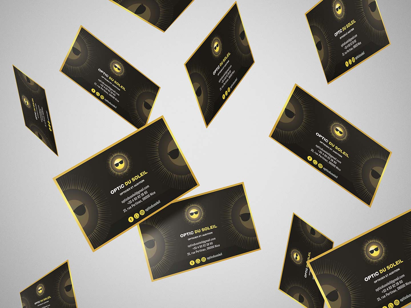
- Creation of business cards.
- Photo retouching and photomontage.
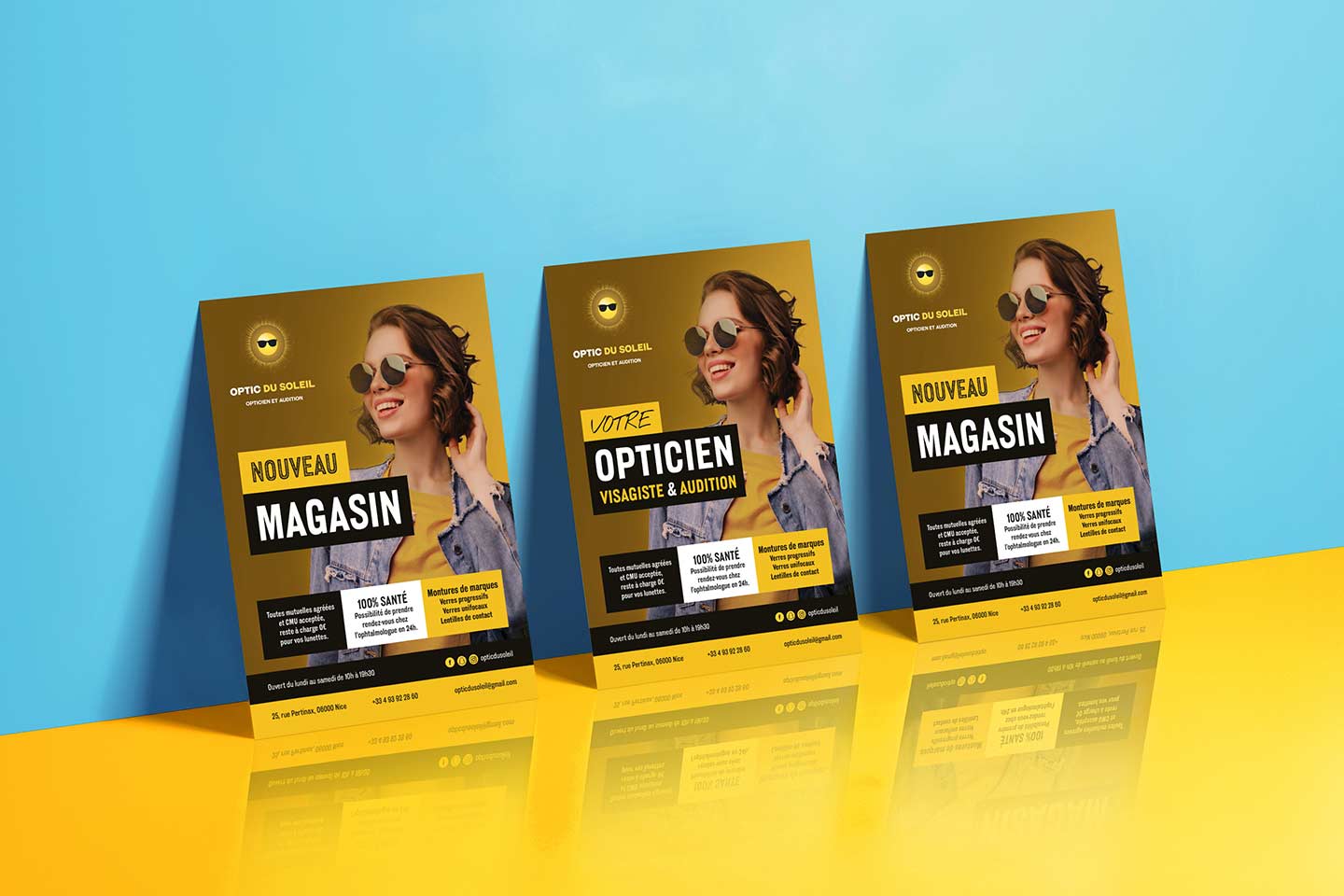
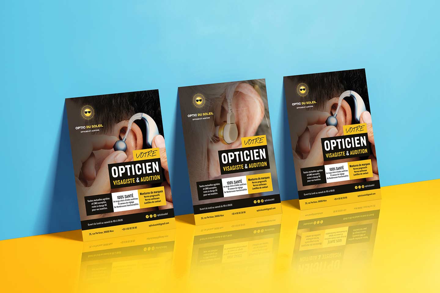
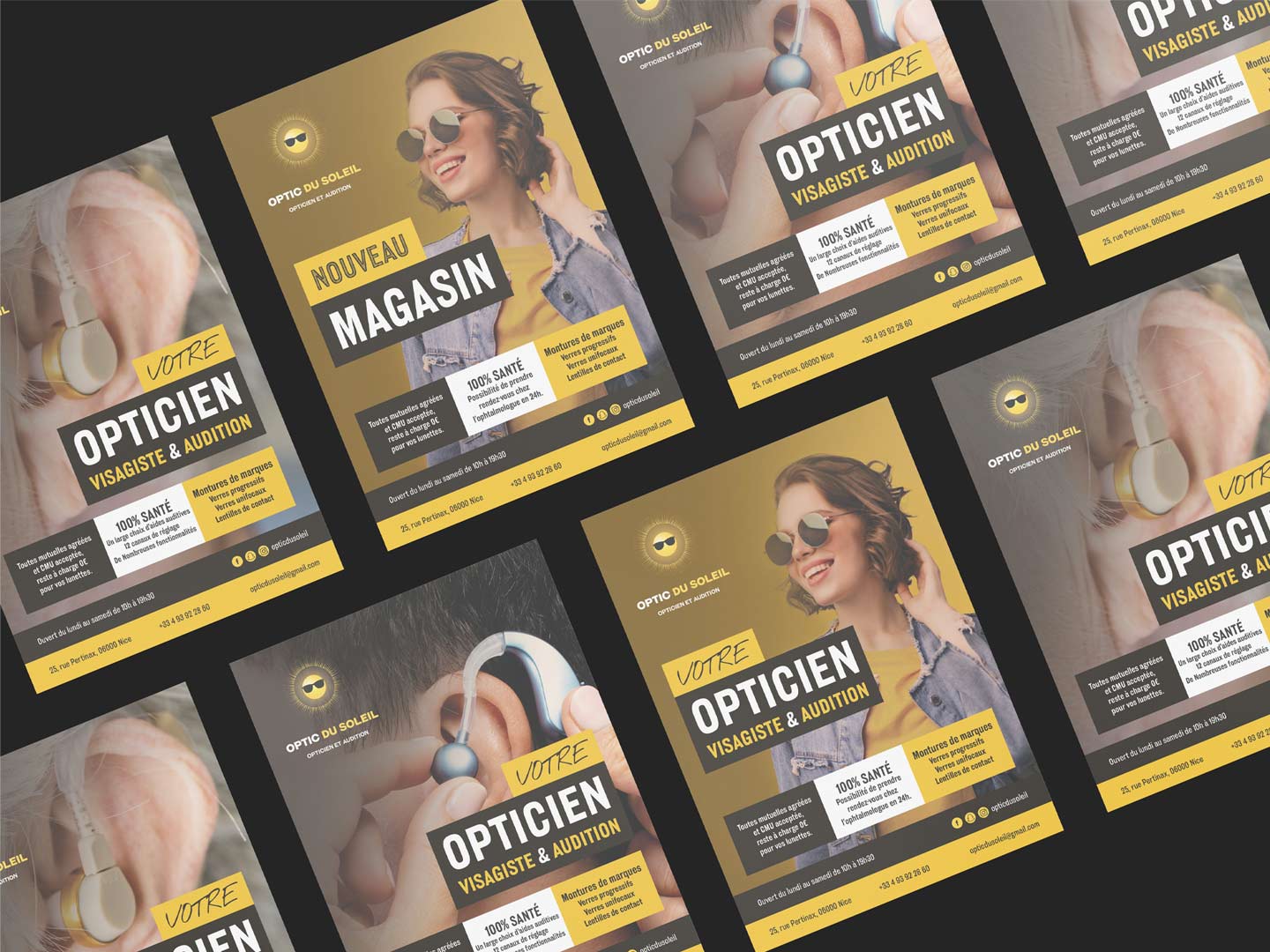
- Design of flyers.
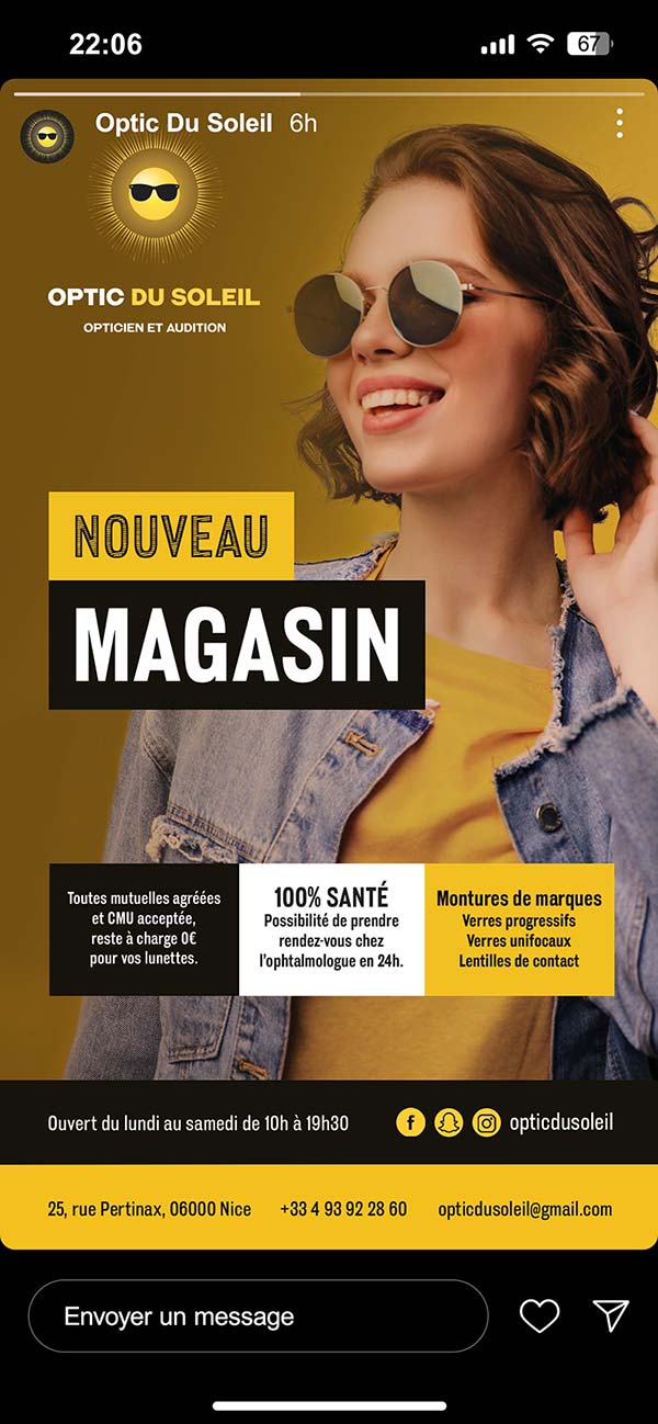
- Creation of web banners for social networks.
Signs and signage
Work carried out:
- Help in writing specifications.
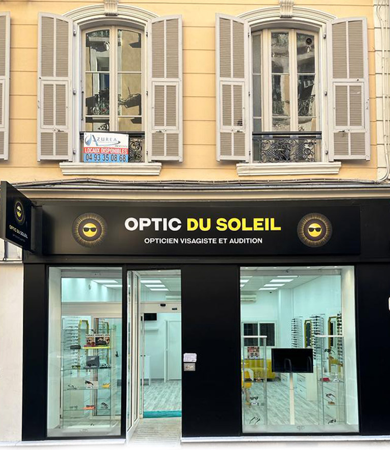
- Design of the sign, flag and signage.
- File management for the printer.
Colors
I created a color palette based on golden yellow, white and black, to create a modern, attractive, dynamic and professional style. The palette corresponds to the company SN OPTIQUE. This mix of warm (golden yellow) and neutral (black, white) tone stimulates, soothes and reassures.
Confidence
and optimism
Elegance, rigor,
seriousness and refinement
Purity
and wisdom
Fonts
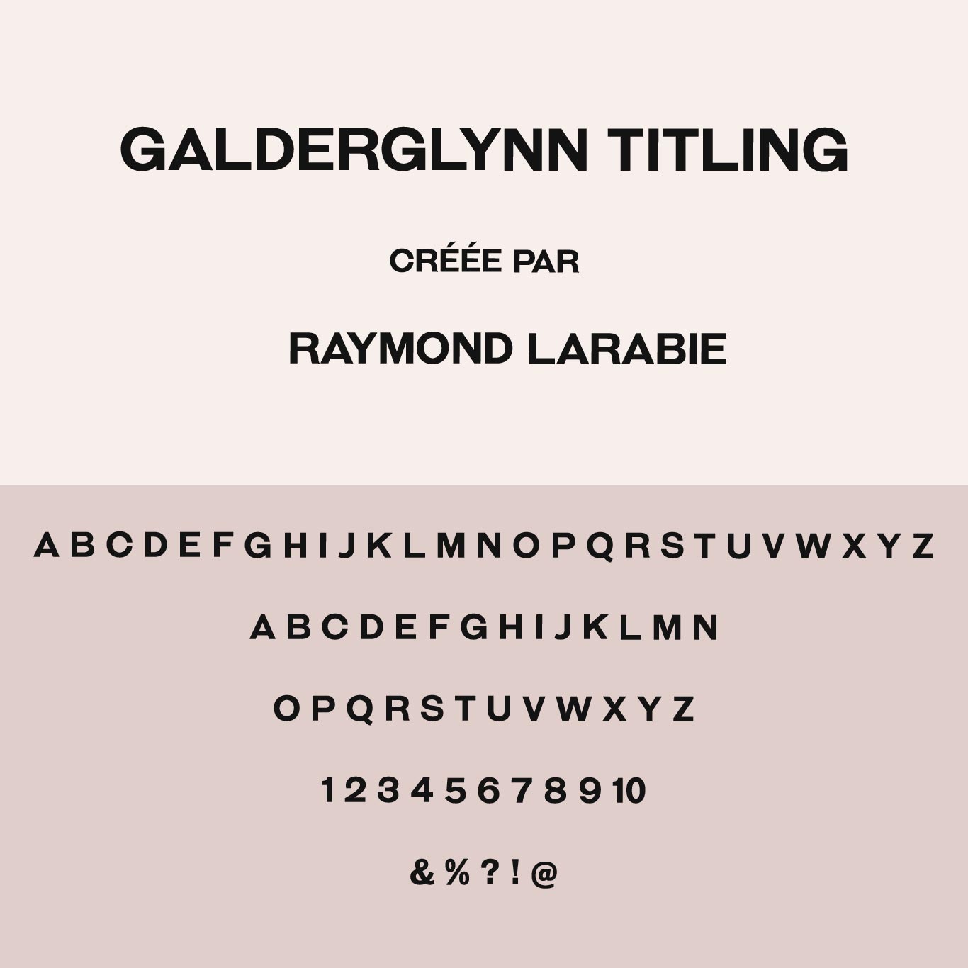
For the logo design I used Galderglynn Titling. The Galderglynn Titling font, is classic, elegant and timeless, with round, airy letters that inspire sympathy. Plus, it sets a serious tone. Which gives a modern rendering and elegant, which corresponds to the image of Optic Du Soleil.
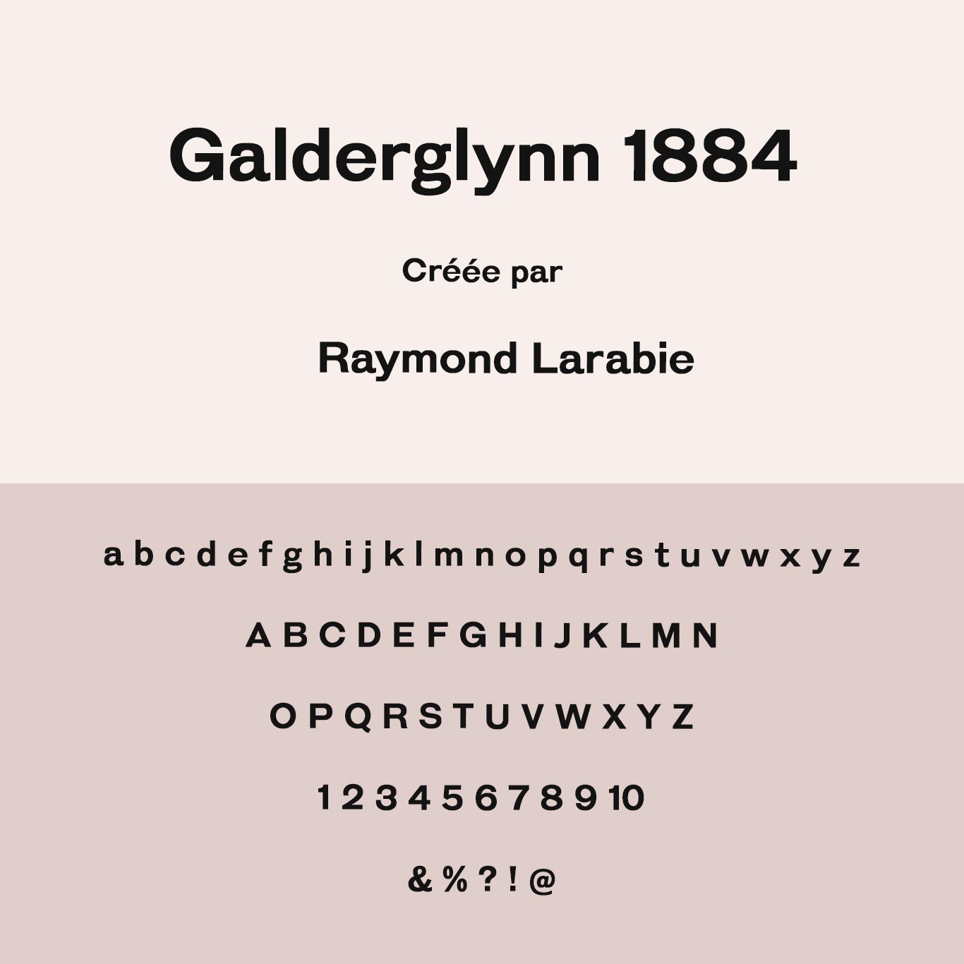
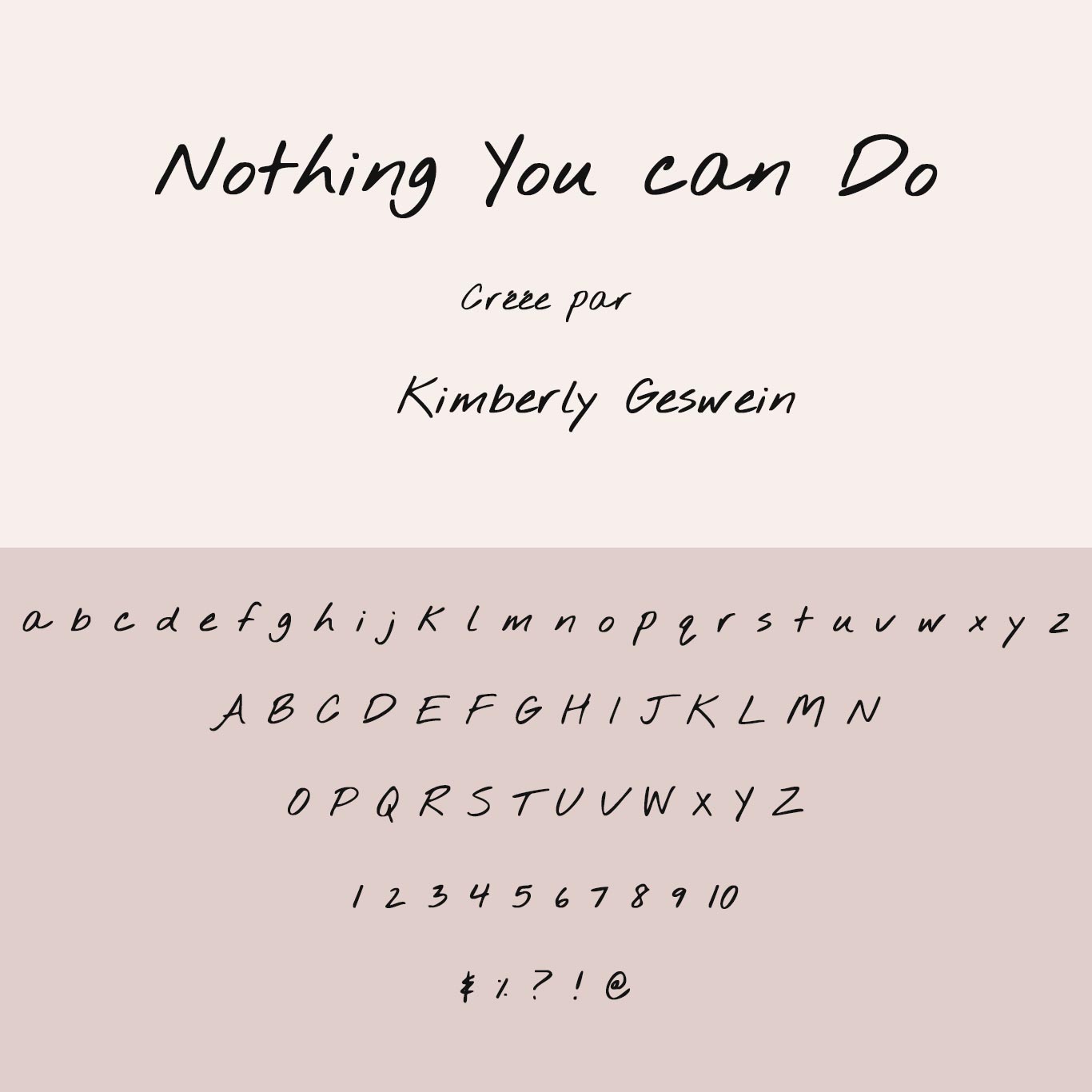
For the design of the print and web communication tools, I used Galderglynn 1884 and Nothing you can do regular, for the titles and body text.
Photos and images
Concerning the photos for the communication tools, I used the Freepik.com image bank.
Logo design
For the creation of the logo, I was inspired by different elements:
- The sector of activity.
- The eyes and more particularly the iris.
- The story of the founder and the company.
- Targeted audiences.
- Their objectives.
- My mission.
- The choice of the name “Optic Du Soleil”
I integrated the sun wearing sunglasses, as desired by the company SN OPTIQUE.
For the logo design, I also used the iris, to illustrate the rays of the sun.


Optician Facialist flyers design
Hearing aids flyers design
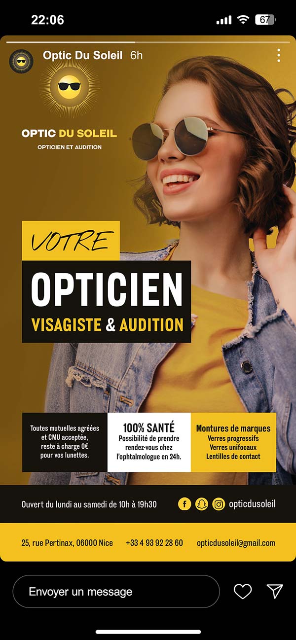
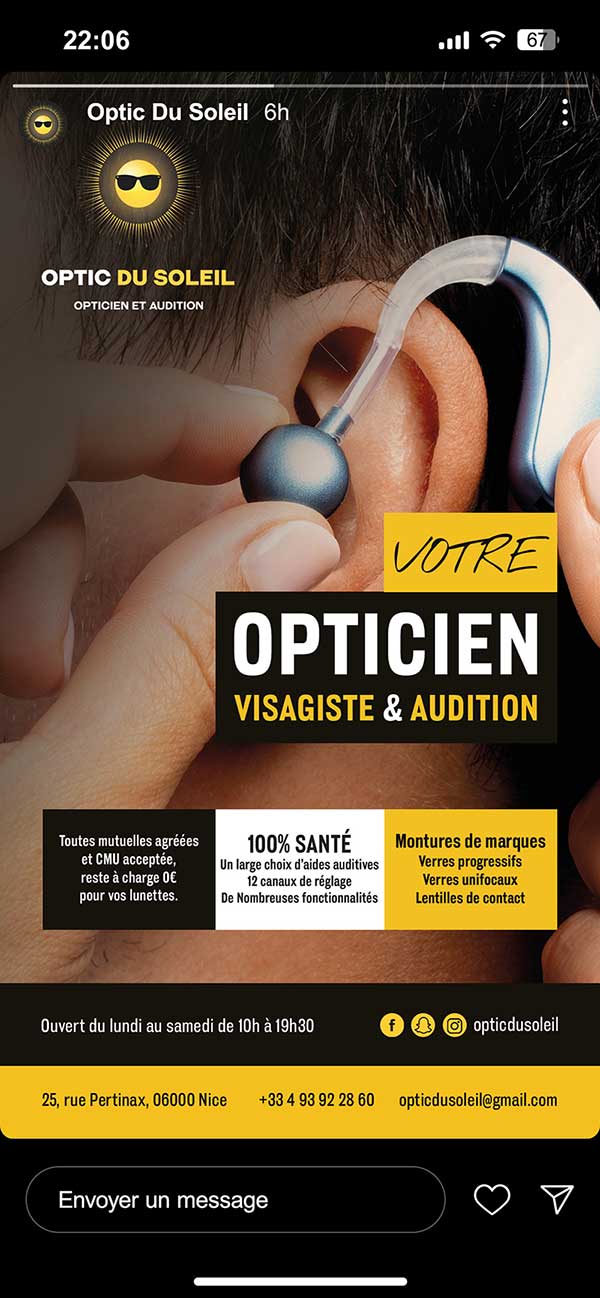
Web banners design
These web banners will be used for the social networks Snapchat, Facebook and Instagram.

The flag sign

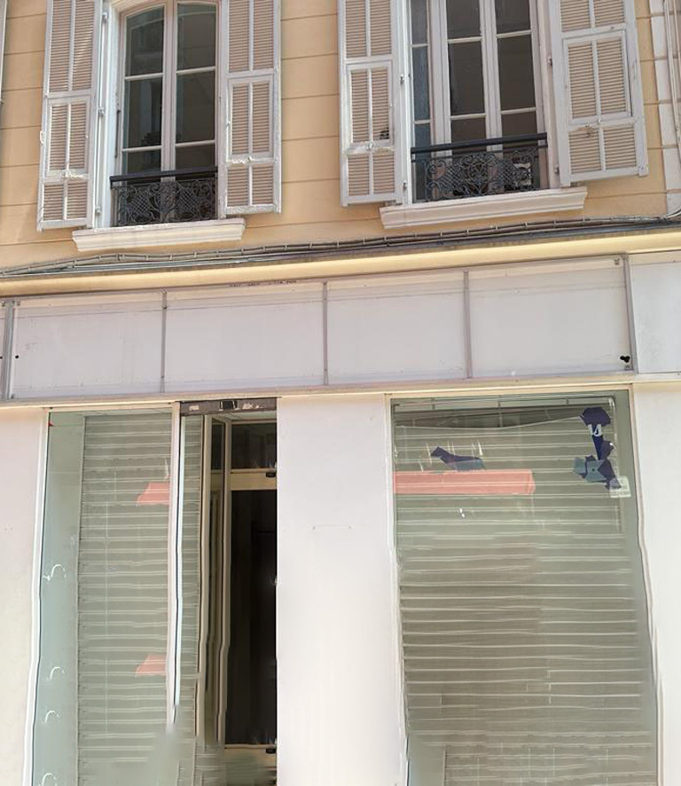
Before/after photos


Official video of the store opening
The results
Store inauguration
The inauguration of the Optic Du Soleil boutique took place on Tuesday November 21, 2023. The opening was a real success.
A strong visual identity
The visual identity created reflects the company's values. Their identity is strong, modern, dynamic, warm, a little offbeat and attractive as the company wanted. In addition, the quality of the design attracts attention and helps to develop the visibility of the store.
Very happy with the result
The company SN OPTIQUE is very satisfied with its visual identity, the brand and the communication tools created.
More serene in setting up
The fact that the company SN OPTIQUE entrusted me with the creation of its visual identity, its brand and its communication tools, this allowed it to to focus 100% on opening its store.
Client testimonial
I am extremely happy with the work done by Eryphilia, for the creation of my logo, my sign, my business cards and my flyers. Eryphilia is very professional and she was able to fully meet my expectations. I recommend her to everyone.
Fofana Namori
President of SN Optique and founder of Optic Du Soleil

